Neon Harbour Logo Neon Harbour Contact Us
Contact Us

Creating Hong Kong Neon Colour Palettes for Web Design

Learn how to combine vibrant neon accents with dark backgrounds while maintaining readability. We’ll cover colour theory, contrast ratios, and practical implementation using gradient light trails.

12 min read Intermediate March 2026
Modern urban street at night with bright neon shop signs reflecting on wet pavement, vibrant cyan and pink neon lights glowing against dark buildings
Marcus Lam, Senior Design Director

By Marcus Lam

Senior Design Director

Understanding the Hong Kong Neon Aesthetic

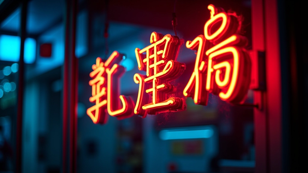
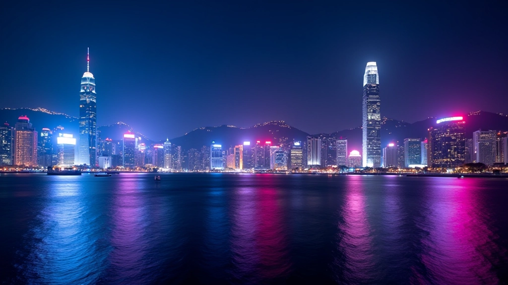
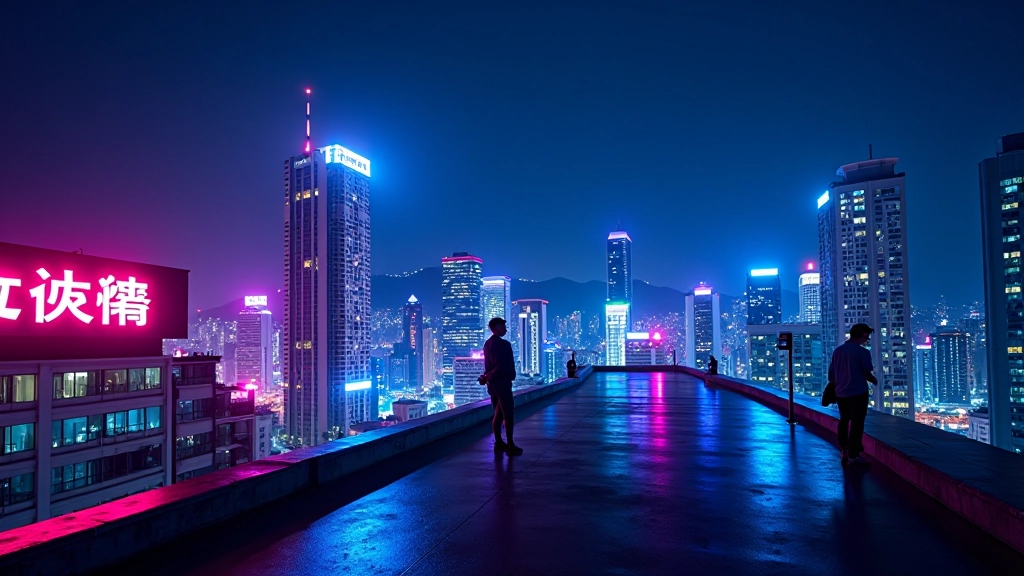
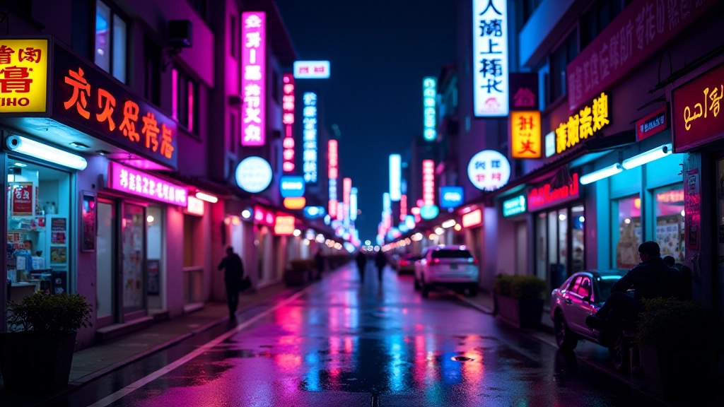
Hong Kong’s skyline after dark isn’t just visually stunning — it’s a masterclass in colour harmony and visual communication. The iconic neon signs that line the streets, from glowing restaurant characters to vibrant shop fronts, create an unmistakable aesthetic that’s inspired designers worldwide. This palette works because it balances vibrant, almost aggressive colour with strategic restraint.

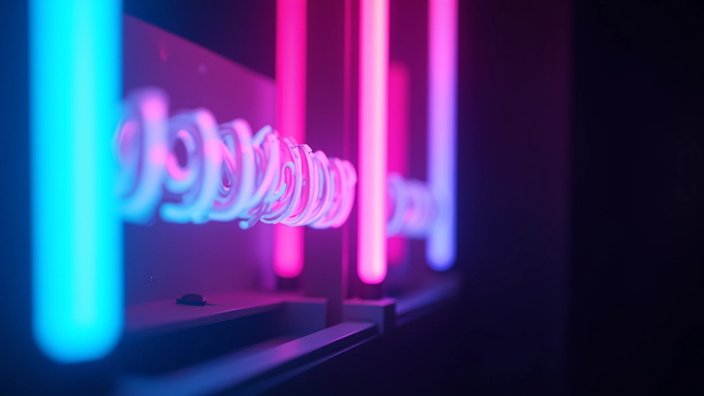
The magic happens when you combine high-saturation neon tones against deep, almost black backgrounds. Think cyan against midnight blue. Hot pink against charcoal. These aren’t random colour choices — they’re rooted in how human eyes perceive contrast and colour intensity. When you’re designing for the web, replicating this feel requires understanding not just which colours work together, but why they work.

Core principle: Neon colours don’t need to cover large areas to make impact. A small amount of bright cyan or vibrant magenta against a dark background creates drama and focus without overwhelming the viewer.

Close-up detail of neon shop sign with bright cyan characters and warm orange accents glowing against dark storefront window
Designer's workspace showing color swatches and digital palette with neon cyan, magenta, and yellow tones arranged on screen

Colour Theory for Neon Palettes

Building an effective neon palette isn’t about picking the brightest colours available. It’s about understanding saturation, luminosity, and how colours interact in dark environments. The key is this: neon colours work through contrast, not volume.

Start with your base — a very dark background, ideally something between #0a0e27 and #0f1629. This creates the canvas. Against this, you’re layering accent colours. The best neon palettes typically use 2-3 primary accent colours maximum. We’ve seen this work consistently:

  • Cyan/Electric Blue: #00d9ff or similar. This reads as cool, tech-forward, and energetic. It’s what you see on most Hong Kong storefronts selling electronics or modern services.
  • Magenta/Hot Pink: #ff006e or #ff0080. Warm, inviting, and grabs attention immediately. Often paired with cyan for maximum contrast.
  • Yellow/Lime: #ffff00 or #d4ff00. Less common as a primary but incredibly effective for calls-to-action or highlight text.

The supporting colours matter too. You’ll need a lighter neutral for body text — something like #e8f4f8 or #f0f1f3 — and possibly a secondary accent in a complementary tone. Hong Kong’s neon signs rarely use more than three accent colours, and neither should your design.

Maintaining Readability: The Contrast Challenge

Here’s where most designers stumble. Neon colours are saturated and bright, but they don’t always work for body text. A full paragraph in bright cyan? Unreadable. That’s why you need a hierarchy.

Your WCAG AA contrast requirements (4.5:1 for normal text) still apply. Bright cyan on dark background typically achieves this easily. But bright magenta on dark background? It might fail. The solution: reserve your brightest neons for headings, buttons, and accent elements. Use them sparingly and strategically.

1

Test your contrast ratio. Use WebAIM or similar tools to verify every text-background combination meets standards.

2

Reserve neon for emphasis. Headings, links, buttons — these are your neon opportunities. Body text should be light neutral.

3

Use weight variation. Bolder neon text reads better than thin. Pair your bright accents with stronger font weights.

4

Add subtle backgrounds. If you must use neon text, add a semi-transparent dark background behind it for readability.

Split screen comparison showing unreadable neon magenta text on dark background versus readable light text with neon accent
Web designer working on neon-themed interface design with CSS editor open showing color variables and gradient properties

Practical Implementation Techniques

Getting neon right in code means treating colour as a system, not random hex values. You’ll want CSS variables for your palette so you can maintain consistency and iterate quickly.

Define your base palette early. Something like this works well: background base (#0f1629), primary neon cyan (#00d9ff), secondary neon magenta (#ff006e), accent yellow (#ffff00), and your text colour (#e8f4f8). Once you’ve got these locked in, apply them methodically.

The gradient light trails effect that makes Hong Kong neon so distinctive? You can replicate that with CSS linear gradients on section dividers or as background accents behind text. A subtle gradient from cyan to magenta moving horizontally across a section creates movement and visual interest without overwhelming content.

Box shadows work beautifully with neon palettes. A glow effect around buttons or accent elements using the same neon colour (with slight transparency and blur) creates depth and draws the eye. Don’t overuse it though — one or two glowing elements per page is plenty.

Practical Tips for Neon Web Design

We’ve tested these approaches across dozens of projects. They work consistently:

Start Monochromatic

Begin with a single neon colour throughout your design. Once you’re comfortable with that, add a second. Three is usually the maximum before it feels chaotic.

Test on Multiple Devices

Colour appearance varies across screens. What looks perfect on your MacBook might be overwhelming on a mobile phone. Test on at least three different devices.

Balance with Whitespace

Neon colours are intense. Give them room to breathe. Generous margins, padding, and spacing between elements prevent visual fatigue.

Use Neon for CTAs

Call-to-action buttons are the perfect home for your brightest neon accent. They naturally draw focus and feel appropriately energetic.

Bringing Hong Kong Neon to Your Projects

Creating an effective neon colour palette for web design isn’t about picking the brightest colours you can find. It’s about understanding contrast, respecting readability, and using intensity strategically. Hong Kong’s iconic neon signs work because they’ve evolved over decades — designers have learned what captures attention without becoming garish.

Start with a solid dark base, add one or two neon accents, test your contrast ratios obsessively, and reserve your brightest colours for moments that matter. Your users will thank you, and your design will have that unmistakable Hong Kong energy that makes people stop and look.

Ready to explore more?

Dive deeper into neon-inspired design techniques with our other guides on gradient light trails and dark interface readability.

Browse all neon design resources

About This Guide

This article provides educational information about colour theory and web design techniques. Colour perception varies based on individual vision, monitor calibration, and lighting conditions. Always test your colour choices across multiple devices and with real users before finalizing designs. WCAG guidelines represent minimum accessibility standards — your specific project may require additional considerations based on your audience and content type.