Neon Harbour Logo Neon Harbour Contact Us
Contact Us

Gradient Light Trails as Section Dividers

Explore how gradient animations create visual separation between sections. This technique draws from Hong Kong’s harbour skyline and adds movement without overwhelming content.

Close-up of illuminated neon sign with cyan and pink glowing tubes against dark night sky
Marcus Lam

By

Marcus Lam

Senior Design Director

What Are Gradient Light Trails?

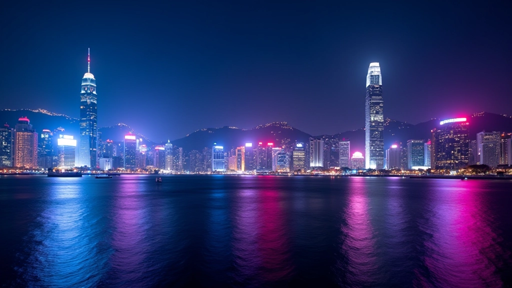
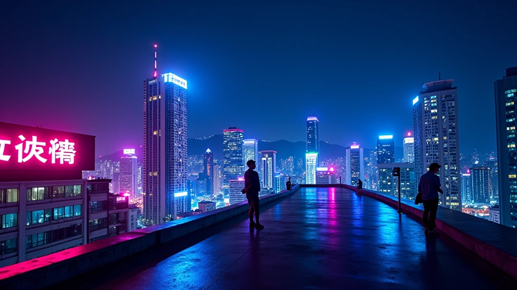
Gradient light trails aren’t just pretty decorations. They’re functional dividers that guide your eye naturally from one section to the next. Think of them like the glowing lights streaking across Hong Kong’s Victoria Harbour at night — they move, they catch attention, but they don’t distract from what matters.

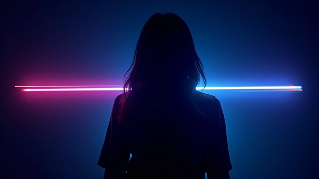
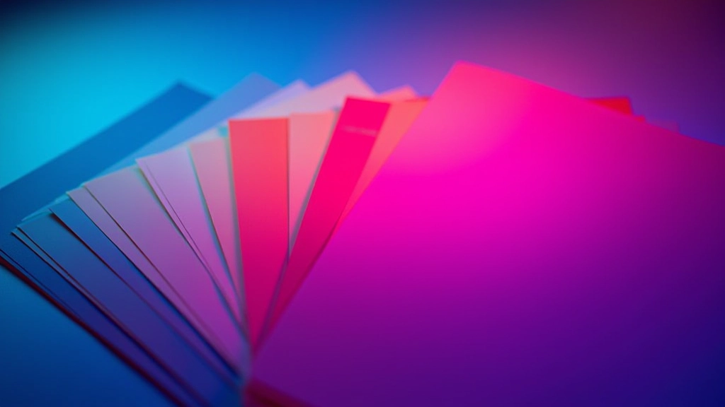
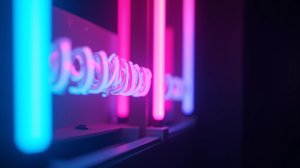
We’re talking about subtle gradient animations that run horizontally (or sometimes diagonally) between content sections. The gradient typically flows from one neon accent colour to another — maybe cyan fading into magenta, or electric purple blending with teal. The animation is gentle, looping infinitely, creating that sense of movement without demanding all your attention.

The key is restraint. You’ll see these trails working best when they’re thin — 2-4 pixels wide — and positioned just below a section’s content. They serve as visual anchors. Without them, sections can feel disconnected. With them, there’s rhythm and flow.

Designer sketching gradient animation concepts on tablet with neon colour swatches visible on desk
Computer monitor displaying animated gradient trail animation transitioning between cyan and magenta colours

The Technical Side

Building a gradient light trail is simpler than it looks. You’re creating a pseudo-element (usually ::after) positioned between sections. The element gets a background with a linear gradient, and then you apply a CSS animation that shifts the background-position continuously.

Here’s what’s happening: you define your gradient with multiple colour stops — let’s say four stops with colours at 0%, 33%, 66%, and 100%. Then you set a background-size larger than the element itself (maybe 200% or 300%), and animate the background-position from 0% to 100%. This creates the illusion of colours flowing across the trail.

The animation duration matters. Too fast (under 4 seconds) and it feels frantic. Too slow (over 12 seconds) and people barely notice the movement. We’ve found 6-8 seconds hits the sweet spot. Plus, using cubic-bezier(0.42, 0, 0.58, 1) for easing makes the motion feel organic, like light actually flowing rather than a mechanical loop.

Where They Work Best

Gradient light trails shine in specific contexts. Portfolio sites? Absolutely. They break up long scrolls of work samples without adding clutter. Dark-themed design platforms? Perfect. The contrast between the neon gradient and the deep background makes them pop. Blog sites covering design topics like this one? Definitely — they add visual interest to dense text.

But here’s where they don’t work: information-heavy dashboards where every pixel matters for content. Corporate intranets where movement can distract from critical data. Accessibility-first applications where animations might trigger motion sensitivity issues. You’ve got to read the room.

The best implementations place trails consistently. If you’re using them as section dividers, use them between every major section — not just two. Consistency creates rhythm. When readers scroll, they start expecting that visual beat, and the page feels cohesive rather than random.

Web page layout showing multiple content sections separated by thin animated gradient lines
Colour palette display showing neon cyan, magenta, electric purple and teal colours arranged as gradients

Choosing Your Gradient Colours

Your colour choices make or break the effect. If you’re going for Hong Kong neon inspiration, you’re typically working with cool tones — cyans, purples, magentas. These pop beautifully against dark backgrounds (which they should, given the dark theme strategy). The gradient should flow smoothly from one colour to the next without jarring transitions.

A practical approach: pick two complementary neon colours and create a 3-4 colour gradient between them. Cyan to magenta is classic. Purple to cyan feels contemporary. Electric blue to pink works for bolder designs. Avoid pure white or pure black in your gradient — they kill the “glow” effect you’re after. Instead, use lighter or darker shades of your chosen hues.

Test your gradient at actual viewport sizes. What looks great at 1440px might feel different at 768px. The trail width (usually 2-4px) should remain consistent across breakpoints, but you can adjust opacity slightly on mobile to prevent the animation from feeling too busy on smaller screens.

Best Practices & Performance

Keep It Thin

2-4 pixels is the sweet spot. Thinner trails feel more elegant and less intrusive. Anything thicker than 6 pixels starts looking like you’re trying too hard.

Optimize Animation Duration

6-8 seconds for a full cycle feels natural. Slower animations (10-12s) work for understated designs. Faster ones (3-4s) suit high-energy interfaces.

Respect Accessibility

Use prefers-reduced-motion to disable animations for users who need it. A static gradient is still visually appealing and doesn’t trigger motion sensitivity.

Use GPU Acceleration

Apply transform: translateZ(0) or will-change: background-position to enable hardware acceleration. This keeps animations smooth without draining battery on mobile.

Educational Note

This article provides technical and design guidance for implementing gradient light trails in web projects. The techniques described are based on standard CSS practices and should be tested across different browsers and devices before deployment. Results may vary depending on your specific design system, browser compatibility requirements, and performance constraints. Always prioritize user experience and accessibility when implementing animated elements.

The Takeaway

Gradient light trails aren’t revolutionary, but they’re effective. They’re borrowed from Hong Kong’s visual language — those glowing lights streaking across the night sky — and translated into something digital. When done right, they feel like a natural part of your design system rather than a gimmick.

Start simple. Pick two neon colours that complement your palette. Create a thin gradient trail. Animate it smoothly. Test it across devices. If it feels right and doesn’t distract from your content, you’ve nailed it. If it feels cluttered or slow, dial it back. The best design decisions come from iteration, not from following a formula.

The next time you’re designing a dark-themed interface with neon accents, consider adding gradient light trails between sections. Your users might not consciously notice them, but they’ll feel the difference in how the page flows. That’s the real power of this technique.