
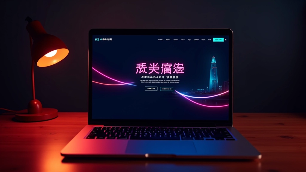
Creating Hong Kong Neon Colour Palettes for Web Design
Learn how to combine vibrant neon accents with dark backgrounds while maintaining readability and visual balance.
Read More

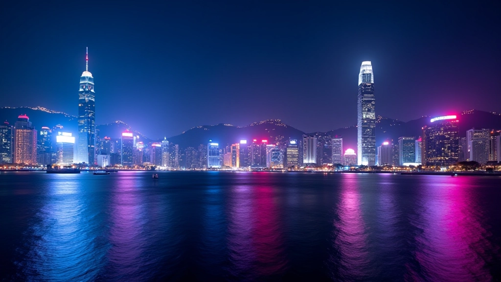
Hong Kong’s neon-soaked skyline isn’t just stunning to look at—it’s a masterclass in visual communication. Those iconic illuminated signs speak a language that’s instantly recognizable: bold colours cutting through darkness, layered typography creating depth, and strategic contrast making information pop off surfaces.
When you’re designing for digital, you’re not just copying these aesthetics. You’re translating the principles that make Hong Kong signage work so brilliantly. It’s about understanding why certain colour combinations feel energetic, how contrast guides the eye, and what happens when you apply these lessons to screen-based interfaces.
The real magic happens when designers move beyond surface-level inspiration. You’ll notice the best digital work doesn’t just borrow neon colours—it borrows the entire logic system. Signage teaches us about hierarchy, readability under pressure, and creating visual systems that work whether you’re looking from 10 metres away or 10 centimetres away.

Hong Kong signage works because it doesn’t compromise on contrast. Neon cyan against deep indigo, hot pink against charcoal—these combinations aren’t random. They’re chosen specifically because they create maximum visual separation. When you’re translating this to web design, it means your primary text needs to be readable, your interactive elements need to stand out, and your hierarchy needs to be instantly obvious.
Look closely at busy Hong Kong streets and you’ll see how signs overlap, cast light on surrounding surfaces, and create visual layers. Digital design can achieve this through thoughtful spacing, subtle shadows, and strategic use of accent colours. You’re not trying to recreate actual light, but you’re creating the illusion of depth and dimensionality that makes designs feel alive rather than flat.
Signage doesn’t exist to be pretty—it exists to communicate. Every colour choice, every font weight, every glow effect serves a purpose. That’s the mindset you need for digital design. Don’t add neon accents because they look cool. Add them because they guide the user’s attention, highlight critical information, or create the emotional tone your product needs.

You can’t just grab a neon colour and hope it works. The best digital designers build a deliberate colour system, and Hong Kong signage gives you the blueprint. Start by identifying your primary dark background—this is your foundation. Most effective systems use deep charcoal, dark navy, or near-black. This isn’t boring; it’s strategic.
Then layer in your accent colours. You’ll typically want 2-3 primary accents (maybe cyan and pink, or teal and coral) plus 2-3 secondary colours for supporting elements. The key difference between amateur and professional work? The secondary colours. They’re not random—they’re carefully chosen to complement your primaries while maintaining readability.
Test everything at multiple scales. A colour that’s gorgeous in a large headline might be exhausting in body text. You’re aiming for that Hong Kong sweet spot—vibrant enough to feel energetic, restrained enough that people can actually read and use your interface without eye strain.
Here’s where most designers miss the mark. They see Hong Kong neon and think “I’ll just make everything bright and saturated.” That’s not translation—that’s mimicry. Real translation means understanding the why behind every choice.
Start small. Maybe you’re redesigning a SaaS dashboard. Instead of making everything neon, use one accent colour strategically—perhaps for call-to-action buttons or status indicators. The surrounding interface stays clean and minimal, letting that accent do its job without overwhelming the user. That’s the Hong Kong principle applied thoughtfully.
Animation and motion matter too. Hong Kong signs don’t just glow—they flicker, they pulse, they create rhythm. In digital work, this translates to subtle transitions, carefully timed interactions, and perhaps a hint of gradient animation on section dividers. Not overdone. Just enough to echo that vibrant energy.
The difference between generic neon design and authentic Hong Kong-inspired work comes down to restraint paired with boldness. You’re not afraid of dark backgrounds, saturated colours, and high contrast. But you’re equally committed to readability, usability, and creating interfaces that are beautiful and functional.
Imagine you’re working on a music streaming platform targeting Hong Kong users. You’d spend time studying the visual patterns in your target environment. You’d notice how neon signs cluster together, creating a visual symphony. How certain colour combinations are used to denote different categories or services. How contrast levels change depending on proximity and context.
This observation phase isn’t optional—it’s foundational. You’re not copying; you’re learning the visual grammar. That grammar becomes your design language, applied to your specific product.

While Hong Kong’s neon aesthetic is visually striking, remember that design inspiration and actual implementation require careful testing. Colour choices that look stunning on a designer’s high-end monitor might feel overwhelming to users on different displays. Always validate your colour contrast ratios, test across devices and lighting conditions, and gather feedback from real users. The principles we’ve discussed—clarity through contrast, depth through layering, purpose over decoration—these are universal. The specific colours and intensity you choose should reflect your audience and context, not just aesthetic preference.

Hong Kong’s illuminated signage represents something special—a perfect intersection of function and beauty. When you’re designing digital experiences inspired by that aesthetic, you’re inheriting principles that have been refined over decades. The bold colours aren’t there just to look good; they guide the eye and communicate instantly. The dark backgrounds aren’t trendy; they’re practical and create the perfect canvas for neon tones.
The translation from physical signage to digital design isn’t about copying hex codes or mimicking glow effects. It’s about understanding why those design choices work and then applying that wisdom to your specific context. It’s about respecting both the inspiration and your users. It’s about creating interfaces that are beautiful, functional, and unmistakably informed by the visual intelligence of one of the world’s most visually distinctive cities.
Whether you’re building a portfolio site, a SaaS dashboard, or a media platform, these principles apply. Start with observation. Build with intention. Test relentlessly. And always remember that the best design isn’t the loudest—it’s the clearest.